OVERVIEW
Information overload.
We live in a continuous improvement business environment, yet somewhere along the way managing documents and business information has become complicated and challenging for business and organisations.
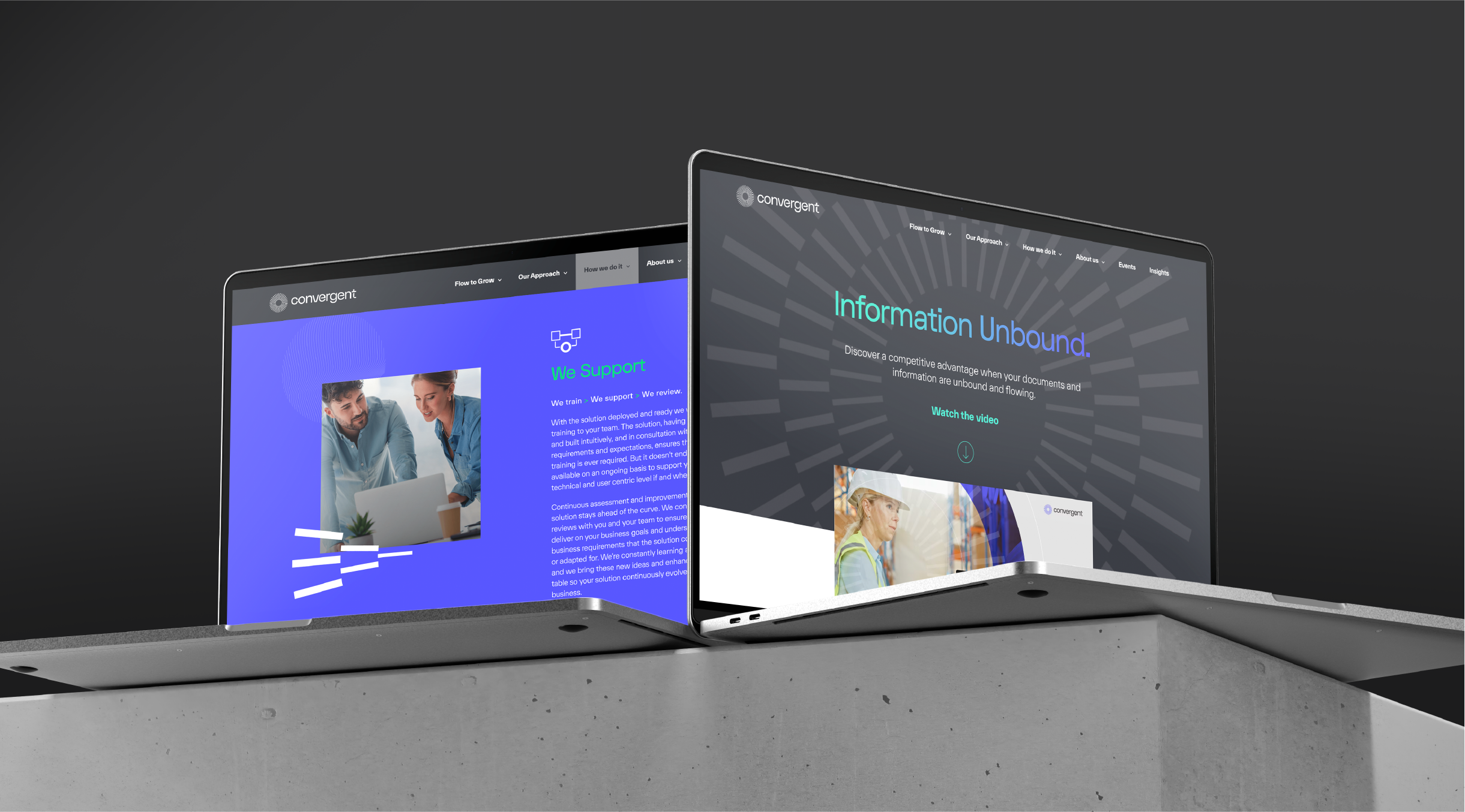
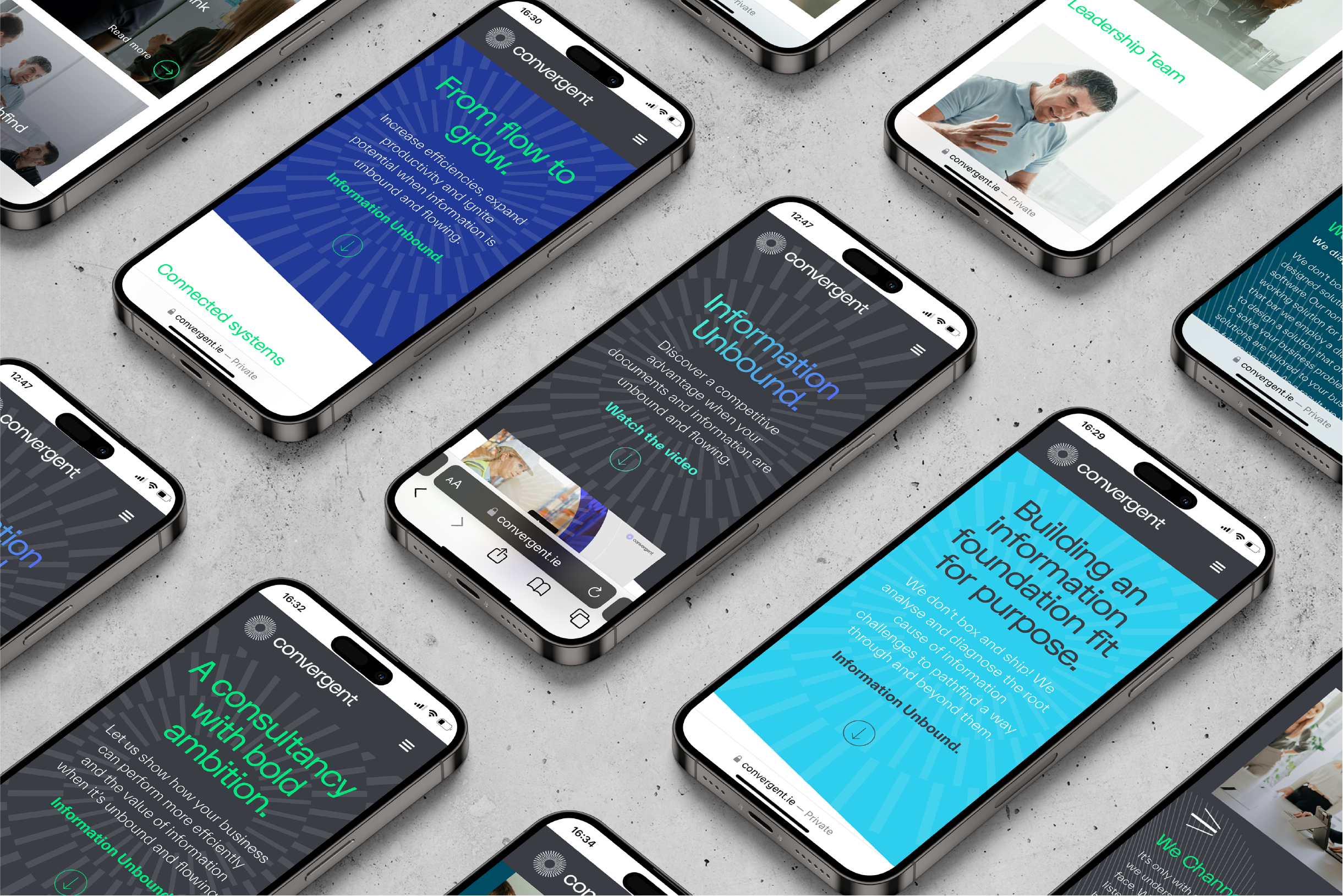
Convergent, an Irish IT consultancy, recognised the impact of this situation on operations and efficiencies. They took a fresh approach to dissolve barriers and enable the free flow of information within organizations, aiming to enhance performance. To leverage this core customer value, they asked Principle’s assistance in repositioning their brand through a new visual and verbal identity.
God is in the distillation.
Mark Twain famously said “If I had time, I would have written a shorter letter”. Similarly in technology speak, IT communications often get tied up outlining lengthy features and while there is plenty going on under the hood, both Convergent and Principle were agreed that we should write that shorter letter so that the simplicity of their approach and benefit to business was understood in the boardroom and not just to the heads of IT.
Dissolve the boundries, and they will come.
To do this we took a deep-dive into the world of document and information management and learned about the challenges of information silos, disconnected systems and the inefficiencies it caused. We engaged with stakeholders and clients who enthusiastically endorsed the value and efficiencies that Convergent’s information management approach, uniquely designed to meet their challenges, had unleashed throughout their business.
Time and again we returned to the same customer experience – by dissolving the barriers between silos and systems, information became free to flow throughout the business, allowing that business to focus on what it does best.
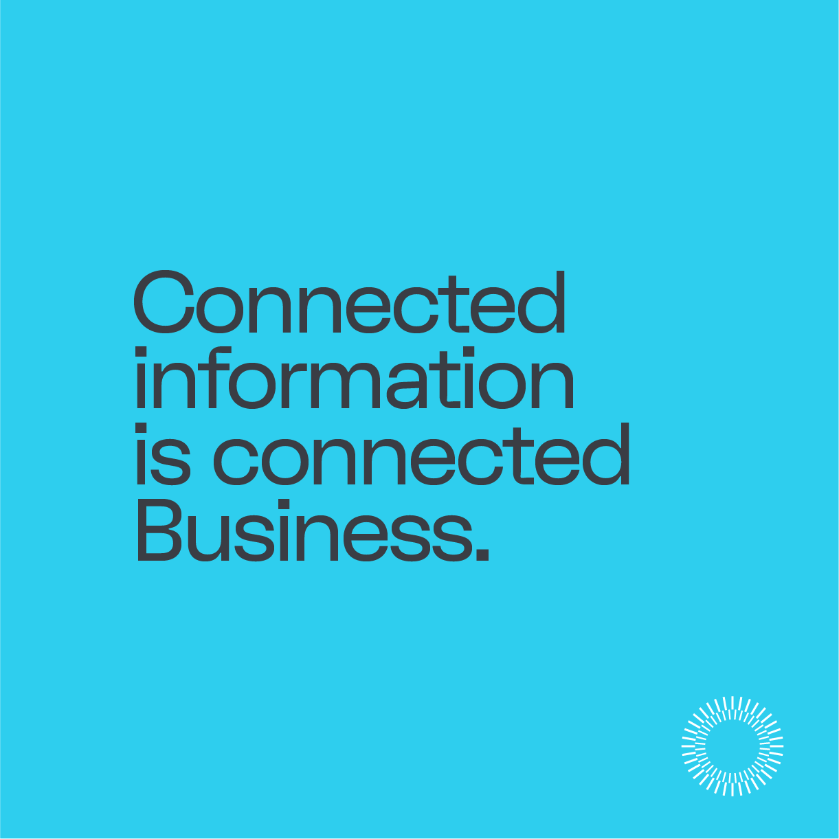
Connected information is connected business.
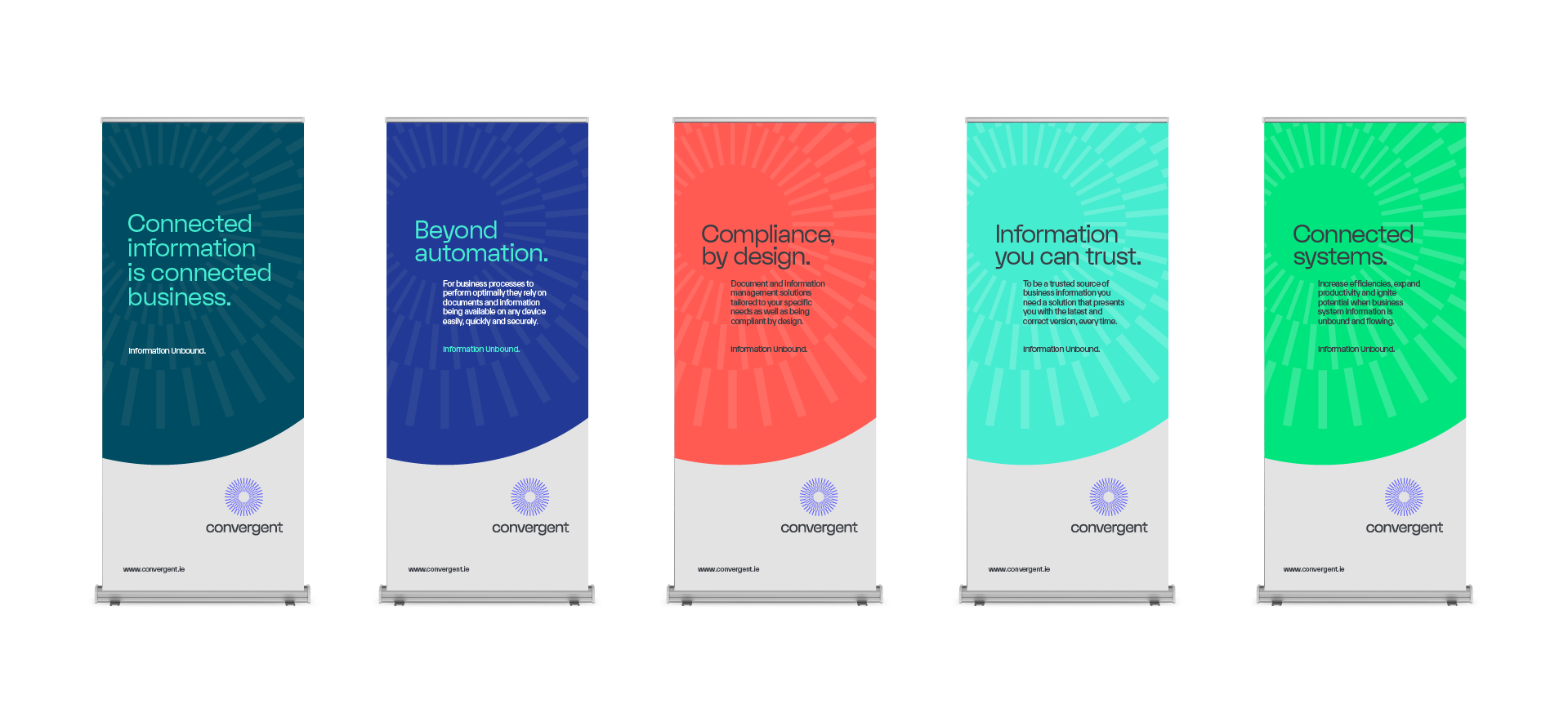
Crafting a verbal narrative for Convergent based on purpose, values, and their unique approach, we provided a north star for their brand and differentiation from competitors. We distilled their true customer value into four propositions, leading with the concept that connected information equals connected business. Each proposition was underscored by the brand’s essence and new tagline – Information Unbound.
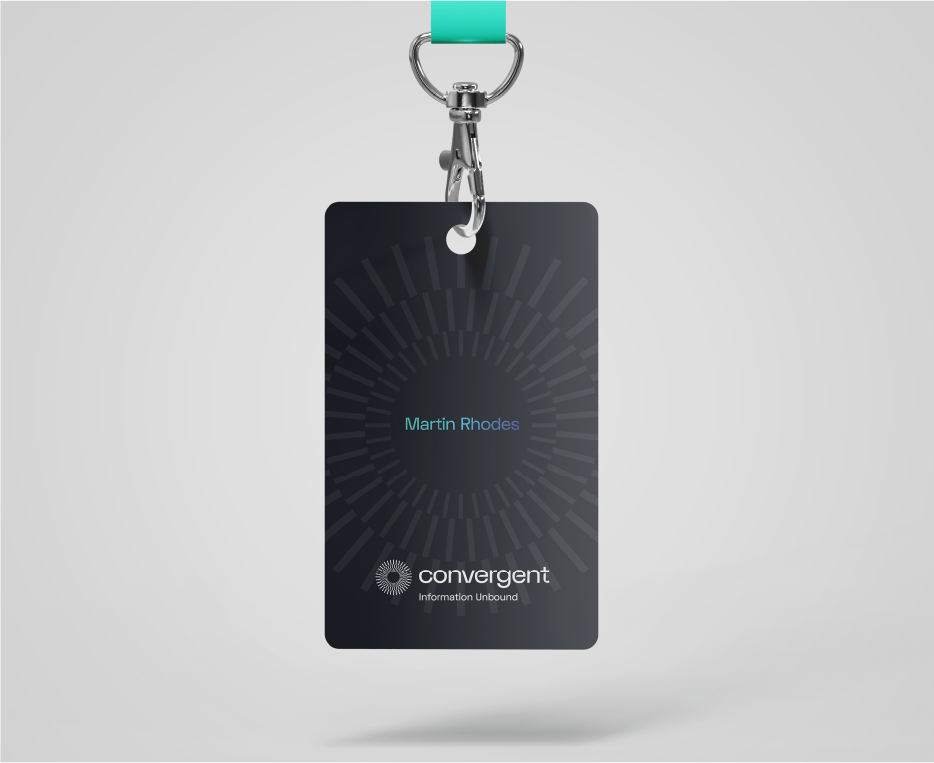
Building our the new brand foundation, we got to work on the visual identity. Taking inspiration from the new tagline, our mark denotes information unified in one single source before the big bang, casting off its boundaries and flowing freely through systems.
The new mark has a delicate and sophisticated feel and it’s flowing nature gives the appearance of constant motion, even in static form.
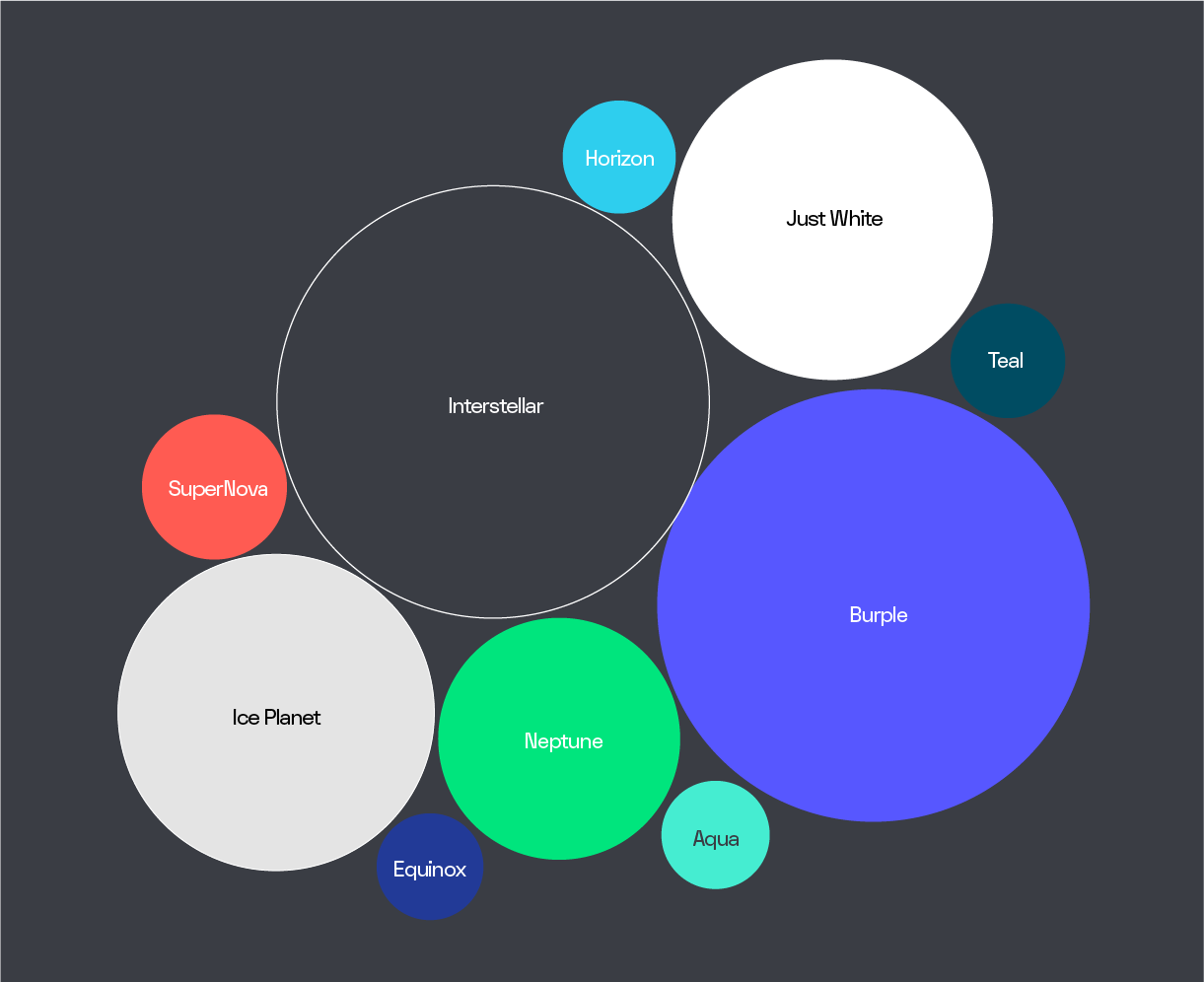
The colour palette continues a playful theme of scientific space cues. The graphic system revolves around one single source, ever contracting and expanding from the event horizon.
WHAT WE DELIVERED
Brand Strategy
– Workshop
– Brand Alignment
– Brand Positioning
– Tone of Voice
– Tagline
– Messaging
Brand Identity
– Visual Brand Identity
– Verbal Brand Identity
– Brand Guidelines
Brand Expression
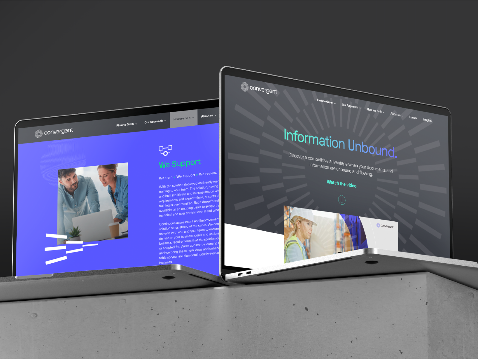
– Website
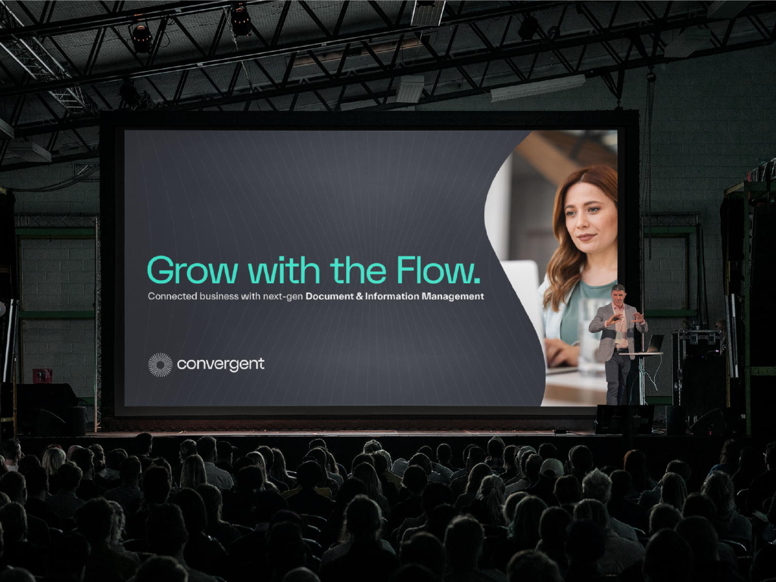
– Presentation Decks
– Environmental

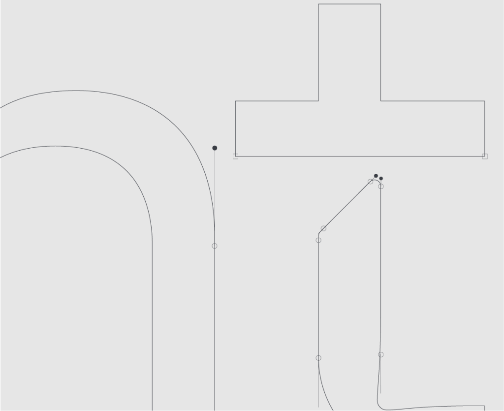
We were agreed that we should write that ‘shorter letter’ so that the simplicity of their approach and benefit to business was understood in the boardroom and not just to the heads of IT.

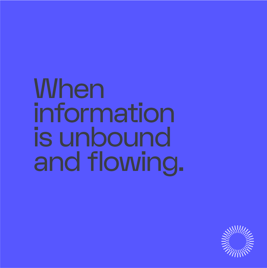

Time and again we returned to the same customer experience – by dissolving the barriers between silos and systems, information became free to flow throughout the business, allowing that business to focus on what it does best.
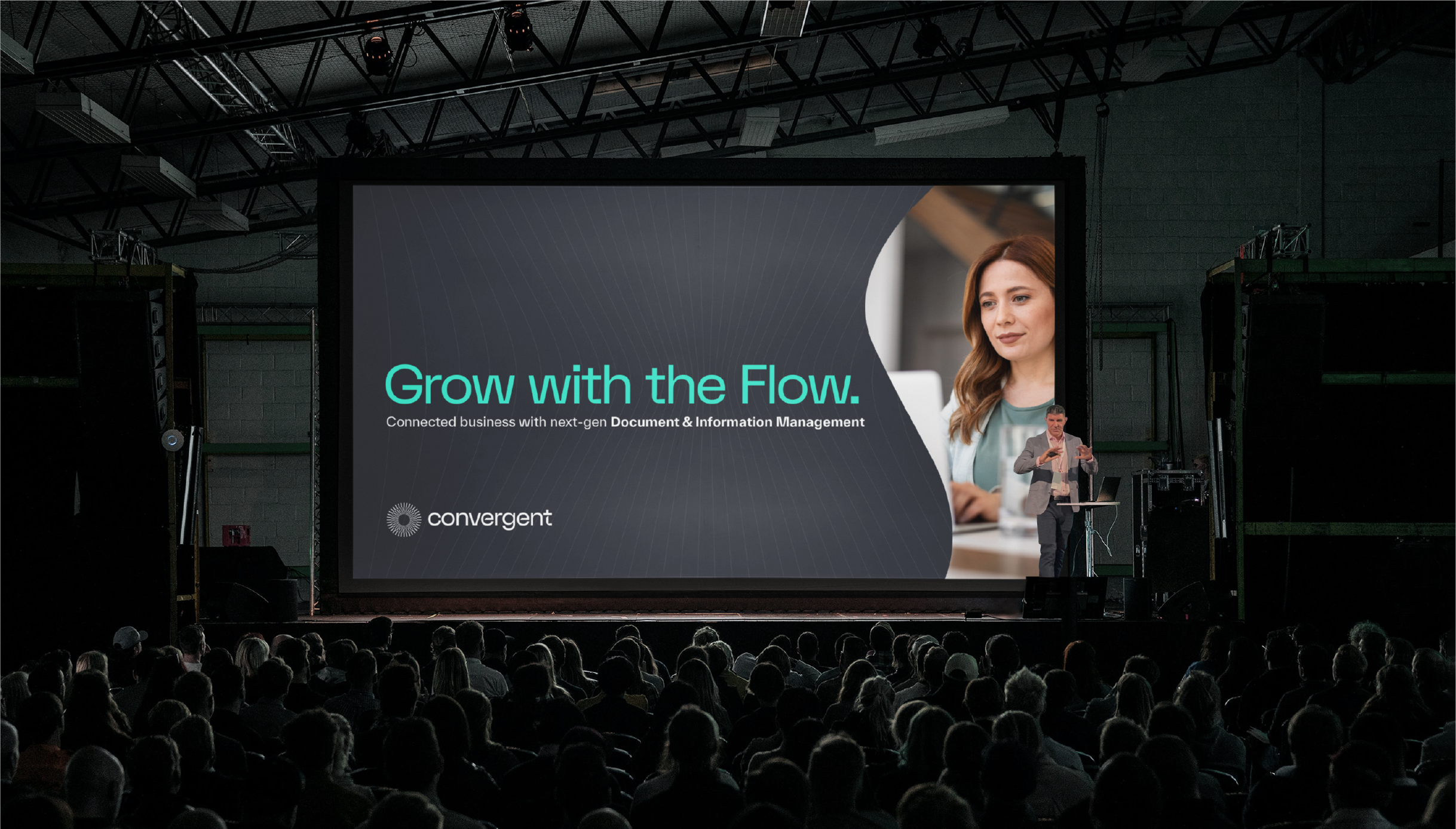

Our mark denotes information unified in one single source before the big bang, casting off its boundaries and flowing freely through systems.
