BACKGROUND
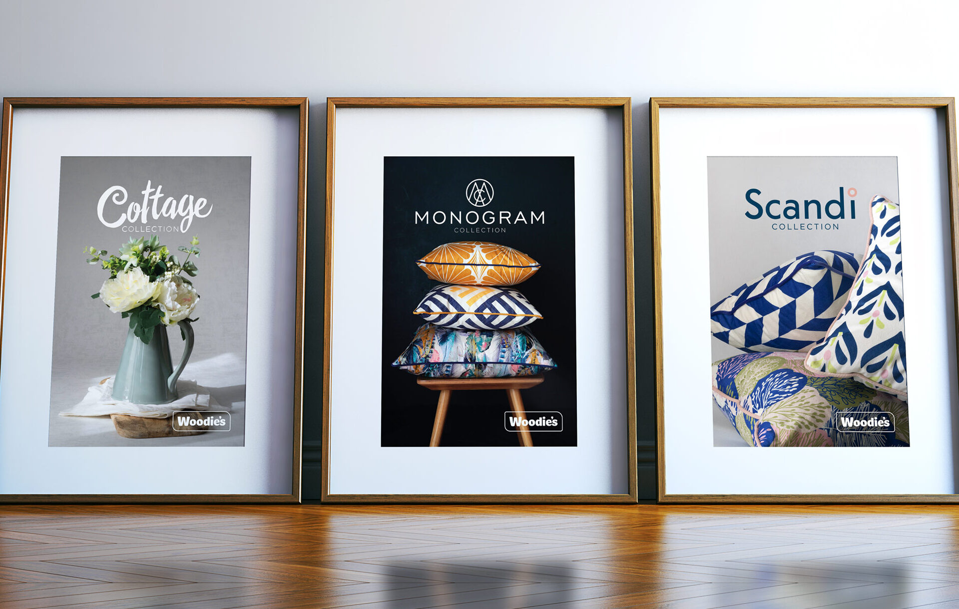
Woodie’s engaged us to design three visual identities to complement their new homeware trend ranges and to provide a wider framework for their own-brand product positioning.
Woodie’s have been market leaders in the Irish home improvement business for over 30 years. Principle have worked closely with them to create their current brand identity that exists across all their marketing touch-points and stores nationwide. So we were very excited when they announced they were launching their very own homeware collection. These new homeware ranges were created to support the strategic ambitions of Woodie’s as as it becomes more inspirational and trend forward in its offering.
THE CHALLENGE
From the get-go it was important that Woodie’s current branding would be incorporated into these new separate but connected identities. Woodie’s needed a clear framework that would work with the existing Woodie’s brand. The framework also needed to be flexible enough to express these new trend-based seasonal collections of tableware, textiles and decor as they changed throughout the year.
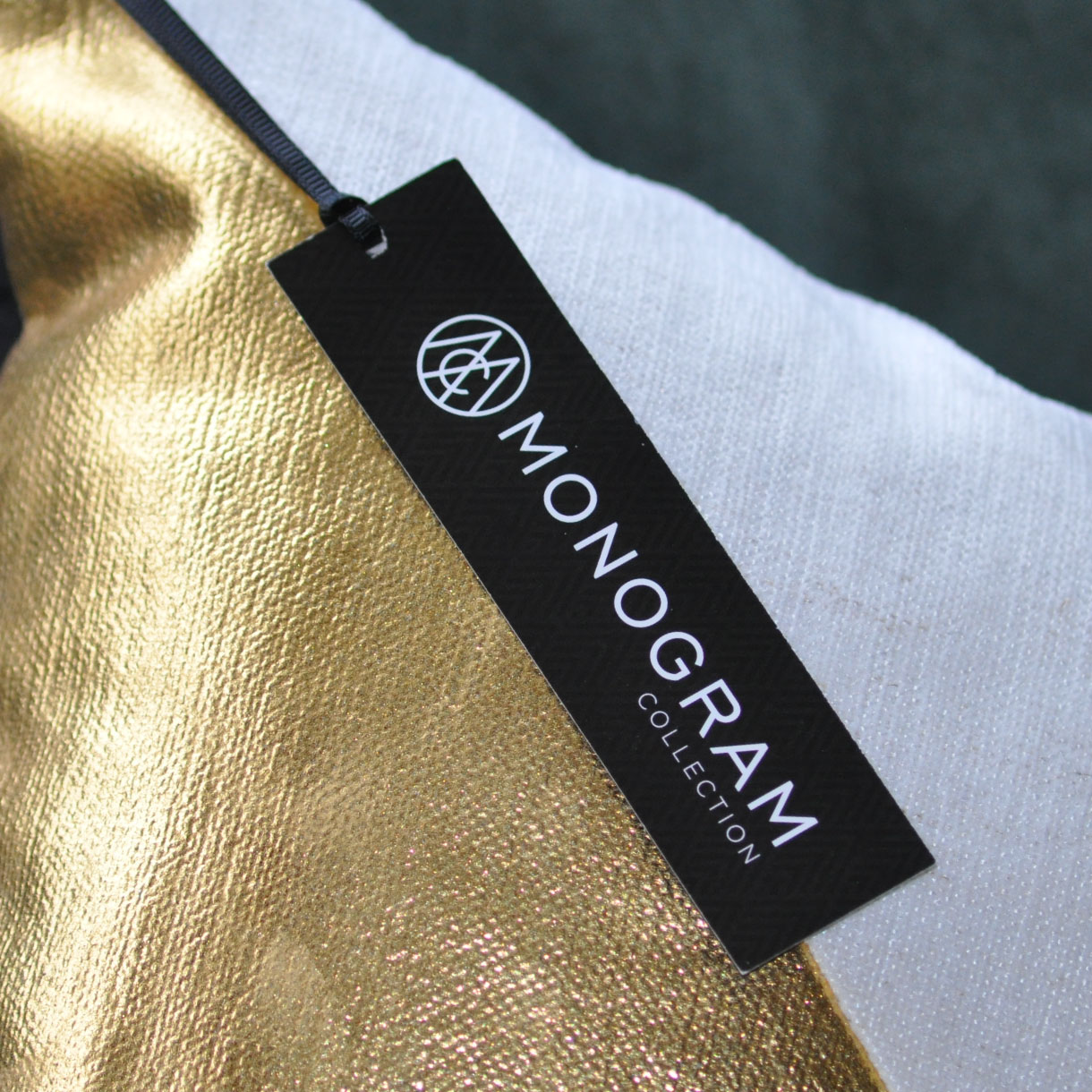
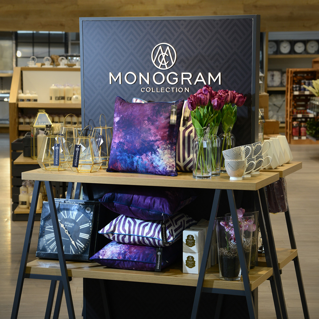
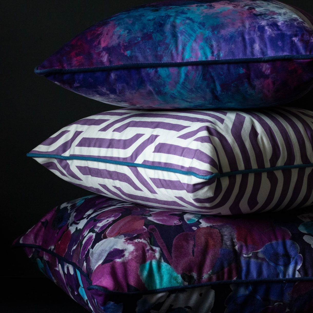
MONOGRAM COLLECTION
The Monogram Collection is an elegant and traditional range. For this we created a classical clean monogram motif with subtle patterns and a restrained monochromatic colour palette.

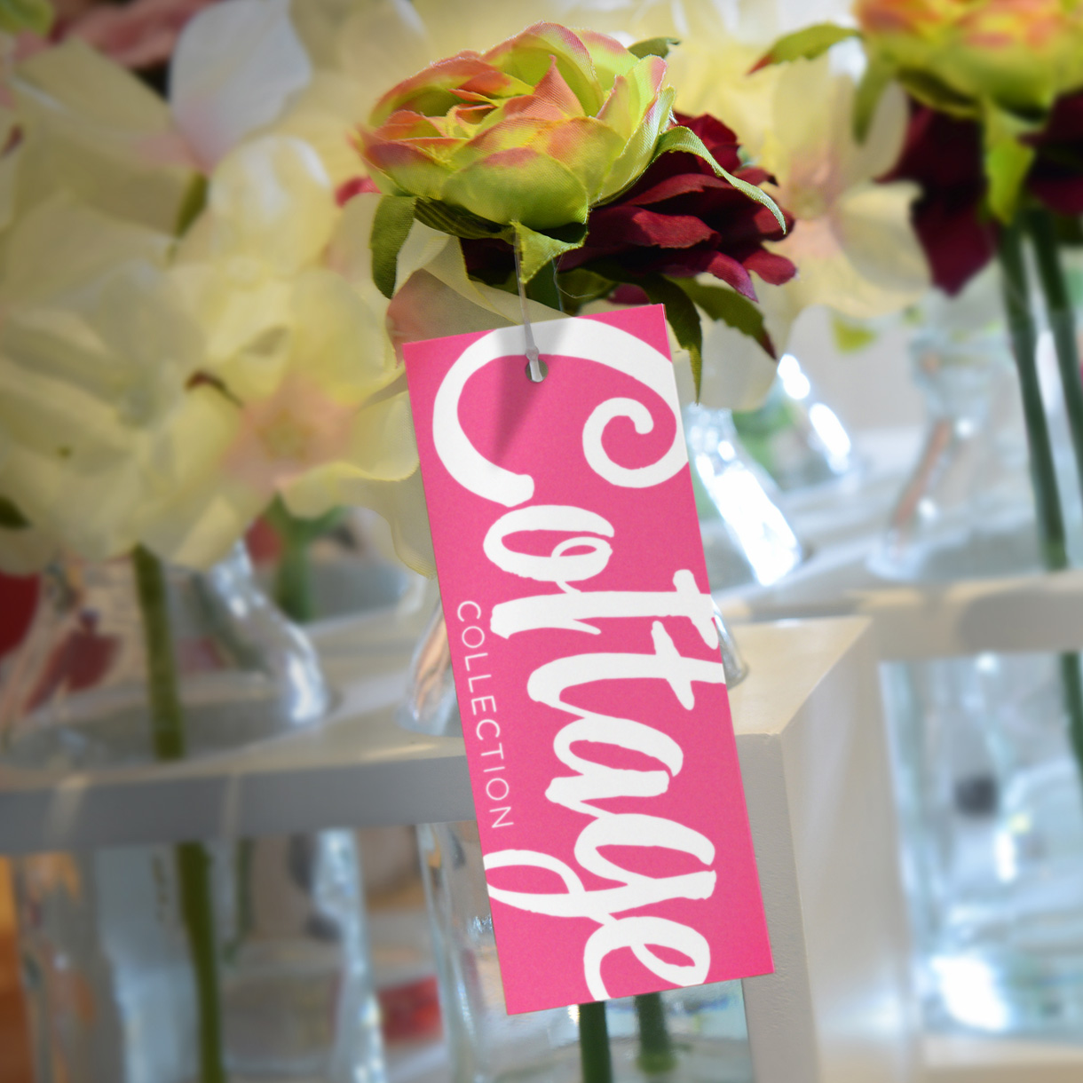
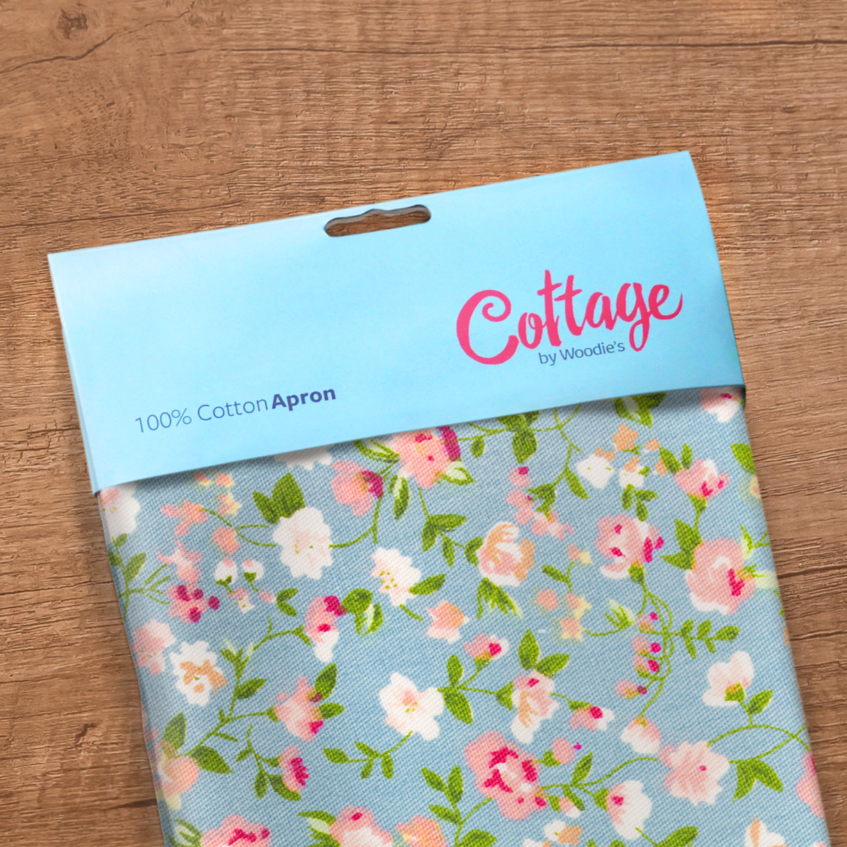
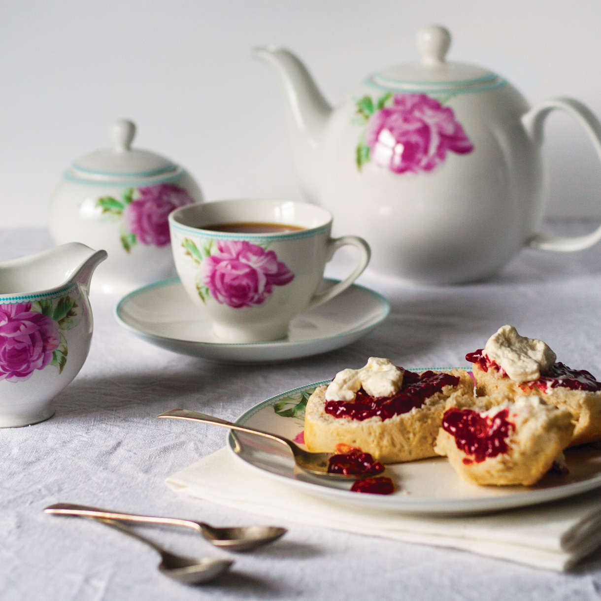
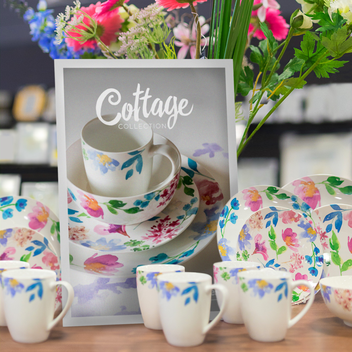
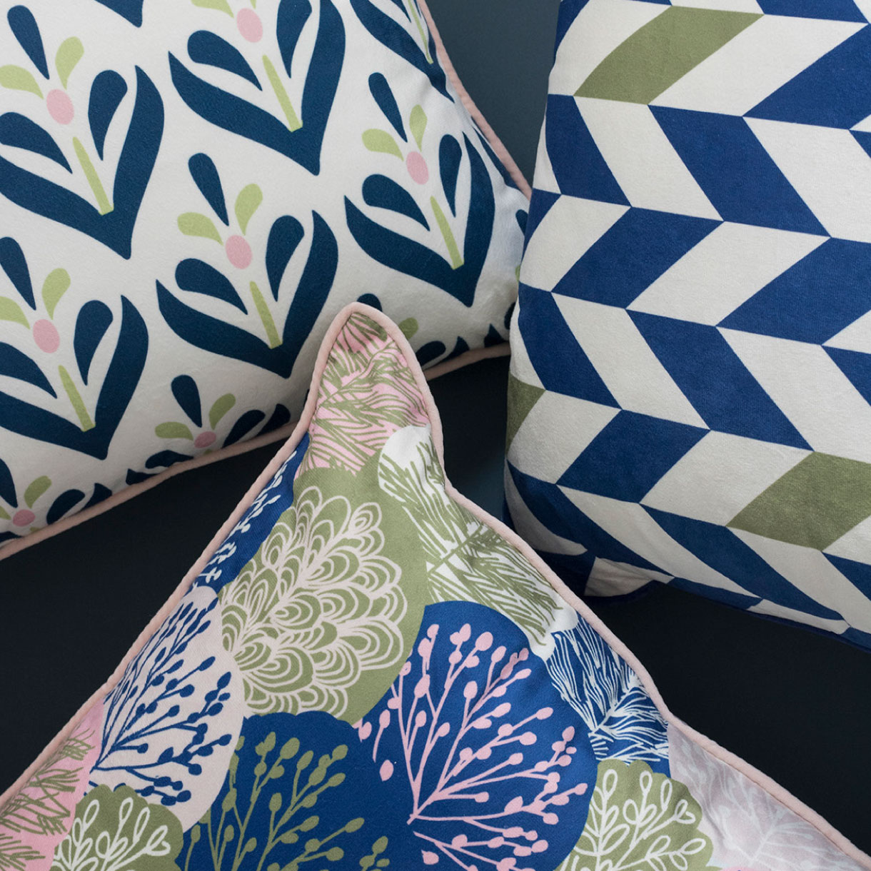
THE COTTAGE COLLECTION
The Cottage Collection is a charmingly vintage and eclectic range with a soft and pretty colour palette. With lots of florals, it derives inspiration from natural materials and traditional elements. We gave this range a hand drawn look with a customised logo that has many flourishes, like the range itself.

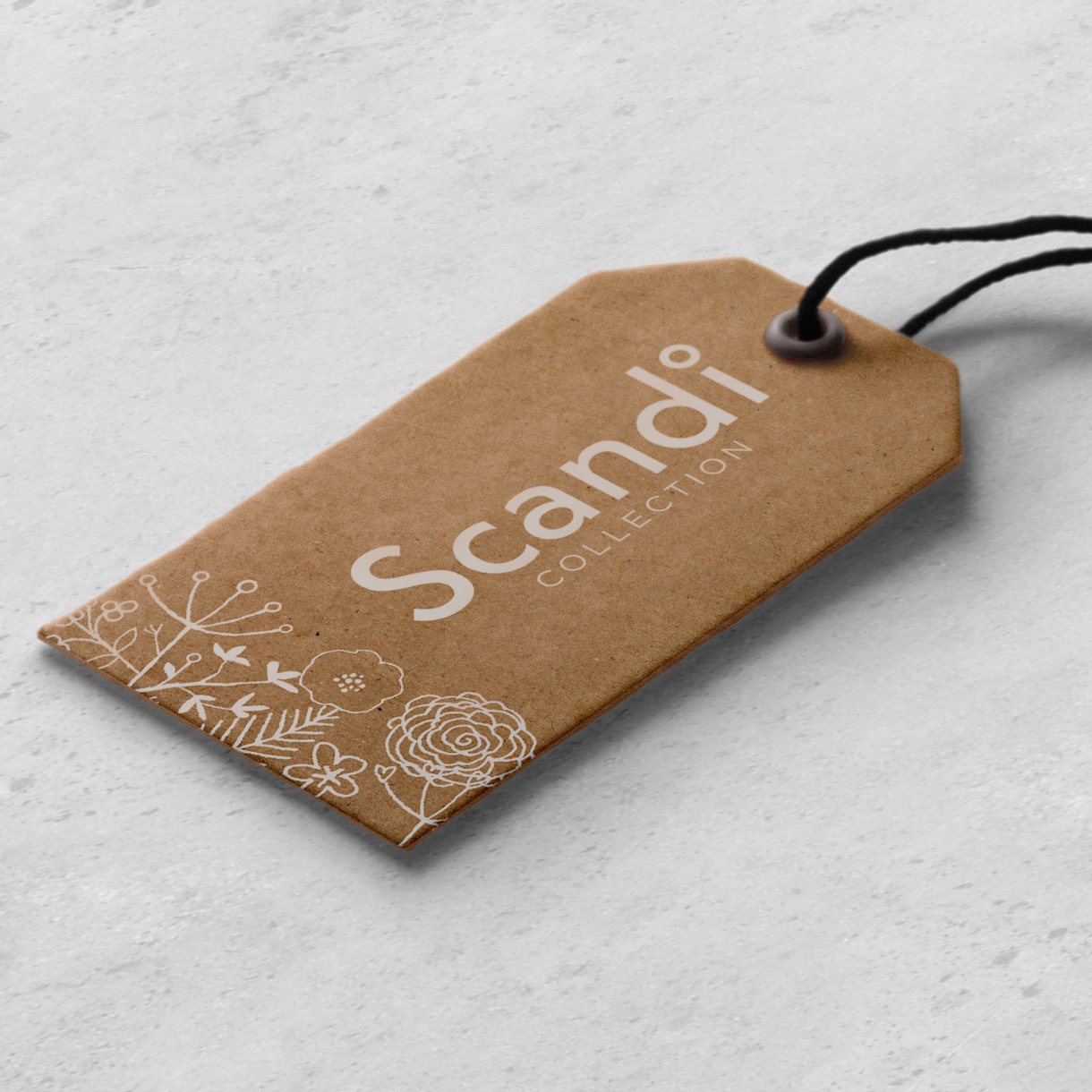
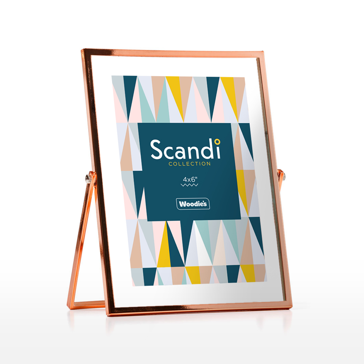
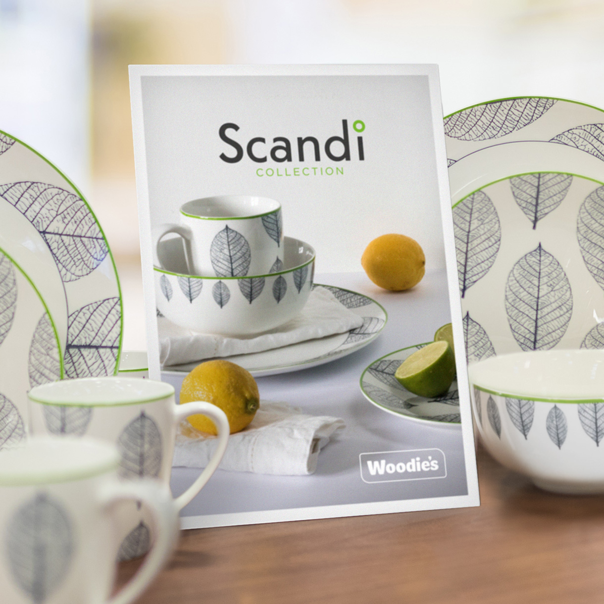
SCANDI COLLECTION
The Scandi Collection is inspired by nature and is marked by minimalistic forms and symmetrical patterns. It has a predominately pale colour palette with the occasional pop of vibrant colour. The mark we created for this range is based on a classical Nordic font. The dot above the lowercase ‘i’ is capped with a little ring. This is a playful nod to the ring symbol that features in Scandinavian letters such as ‘å’ that looks exotic to many English speakers.

OUR SOLUTION
Our overall solution connected these three identities using a simple shared design system. We created a new single colour ‘wireframe’ version of the main Woodie’s logo that would work in tandem with each of these sub-brands. Using this new more neutral logo allowed these new sub-brands to have their own identity traits but also worked to give a clear endorsement by the established Woodie’s brand. Each trend-range mark was also combined with the tag line ‘By Woodie’s’ which helped structure these sub brands internally and to the Woodie’s customer.
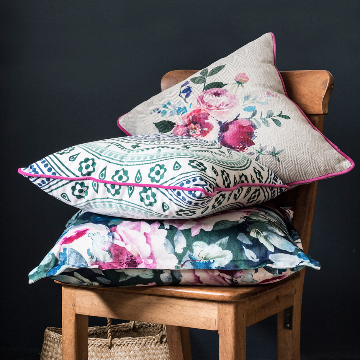
These new collections each have their own distinctive personality traits but crucially work in accord with the wider Woodie’s offering. These distinctive marks and patterns combine with hero photography and visual product displays work well to get the personality of these trend ranges across to the customer in-store.