OVERVIEW
Building a better future brand.
Deposit Return Schemes (DRS) have long been a staple in daily life across mainland Europe and Scandinavia. Embracing a similar commitment to sustainability, Ireland introduced its national Deposit Return Scheme under the 2022 Circular Economy Act. This groundbreaking initiative, which encompasses all beverage producers and retailers, was launched to consumers nationwide on February 1, 2024 under the brand name Re-turn. The brand mark, identity and retail infrastructure are now an indelible feature of Irish life and we’re so proud to have played such a key role in bringing this transformative project to life.
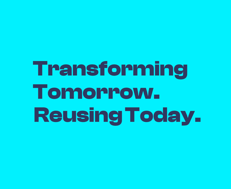
Transforming Tomorrow. Reusing Today.
To establish the new brand internally before driving it forward, we focused on defining its core foundations. Working closely with the DRSI team, we aligned around a clear brand purpose, mission, vision, and values. We created personas for a number of consumer demographics and commercial stakeholders, as each group would have a unique perspective.
There were some initial thoughts offered on brand names and taglines which we tested on consumer focus groups, gauging opinion on these as well as attitudes towards the scheme overall. This insight proved invaluable when we later workshopped and created the brand positioning -“Transforming tomorrow. Reusing today”.
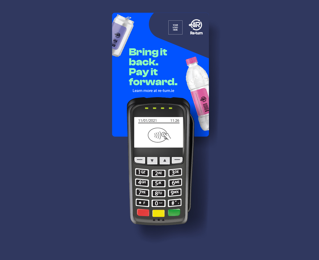
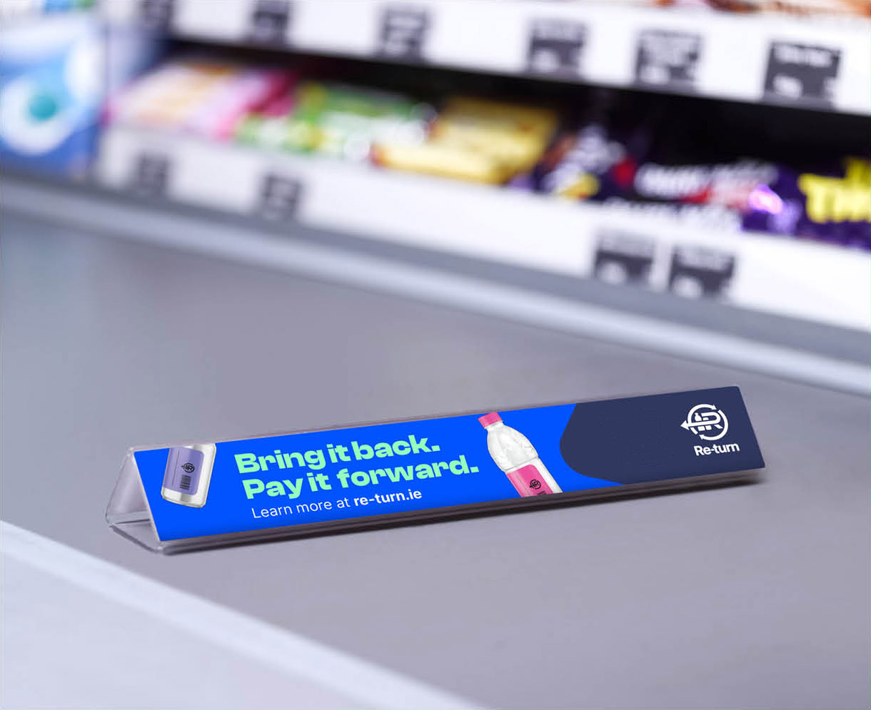
Bring it back, pay it forward.
The brand name “Re-turn”, tested with universal appeal both inside and groups. It alluded to the act of recycling and to consumers getting their deposit back, which was identified as a key communication for the scheme. Equally the tagline “bring it back, pay it forward” is active and won approval while it nicely connects back to our positioning, the act of recycling and the aspirational and environmental benefit.
The future is bright.
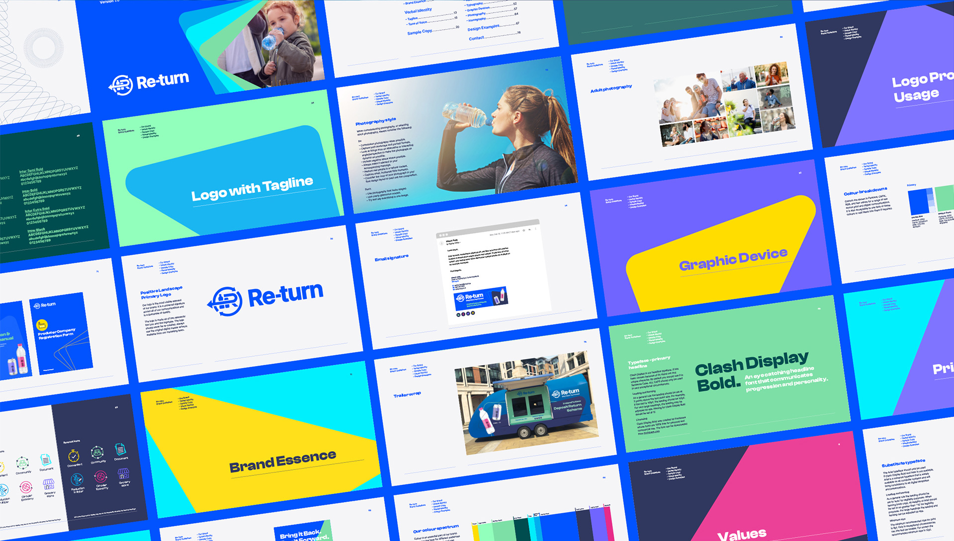
It was vital that Re-turn’s visual identity match the collective energy of producers, retailers and consumers and serve as an invigorating component for the brand. We developed a vibrant, upbeat colour palette, purposefully gravitating away from the stale, overused greens present in the sustainability arena. Instead, we wanted the colours to reflect the bright future ahead, imparting optimism, positivity, and inspiration. The palette is able to successfully create stand out and grab attention, helping to achieve Re-turn’s goal of spreading awareness.
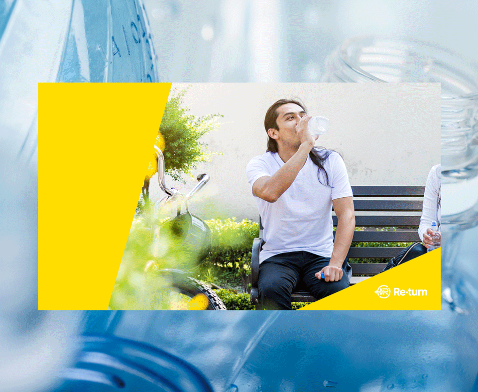
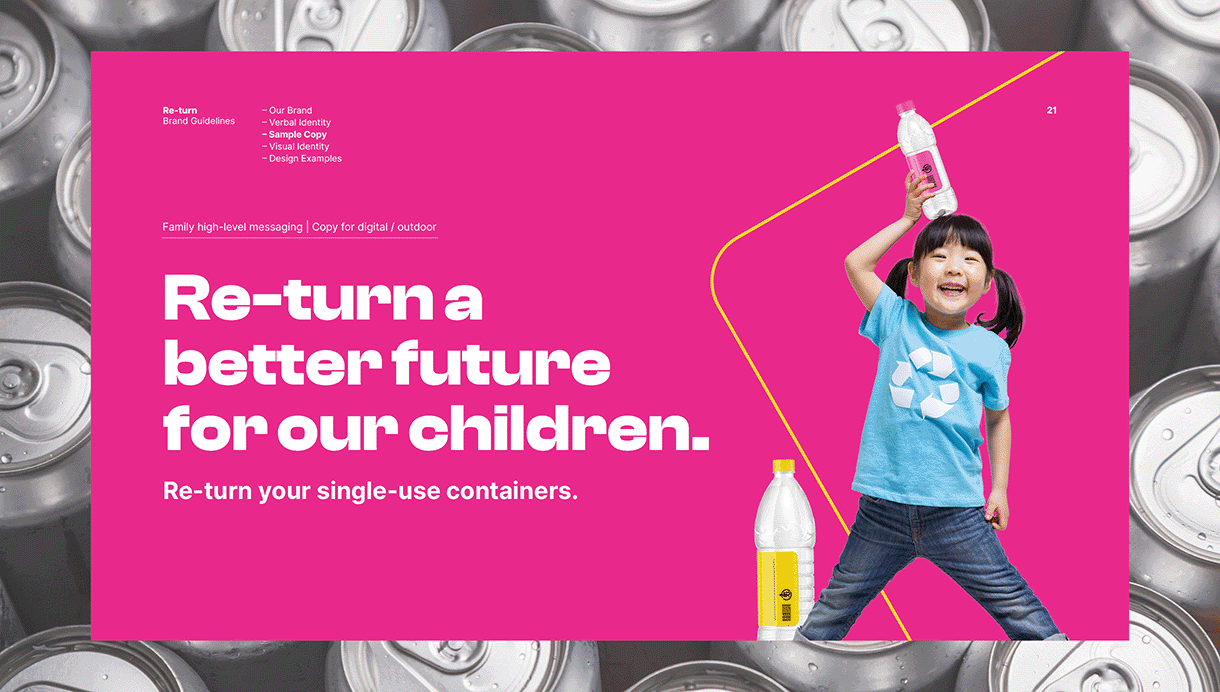
With the next generation a key driver of sustainability efforts for many consumers, the brand should speak to parents and children alike, as well as the environmentally conscious young adults who will become future champions of schemes like deposit return. Dynamic photography of consumers with colorful drinks containers was incorporated into the brand for this reason and will act as a key marketing tool that can flex and grow going forward.
Striking a balance.
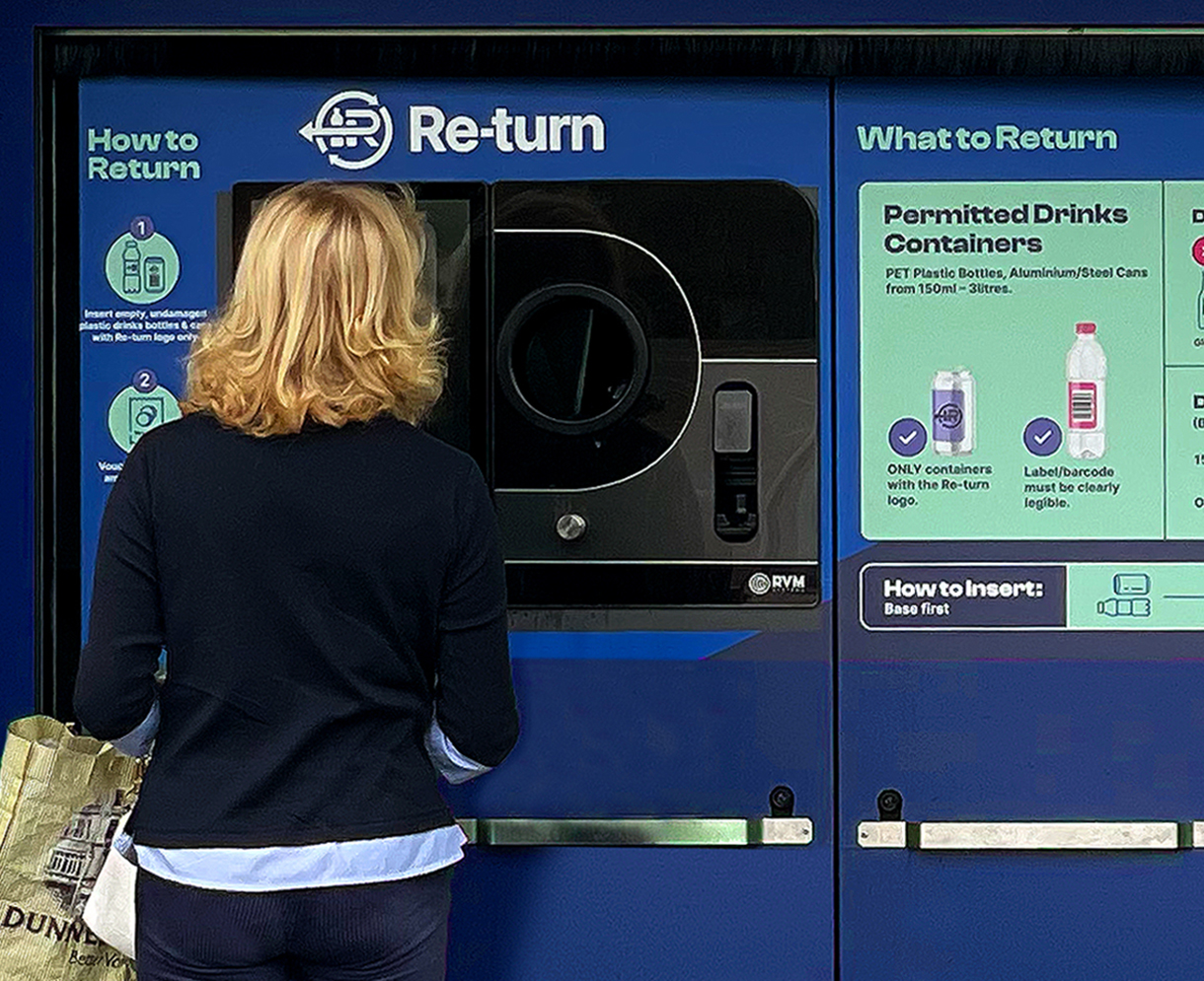
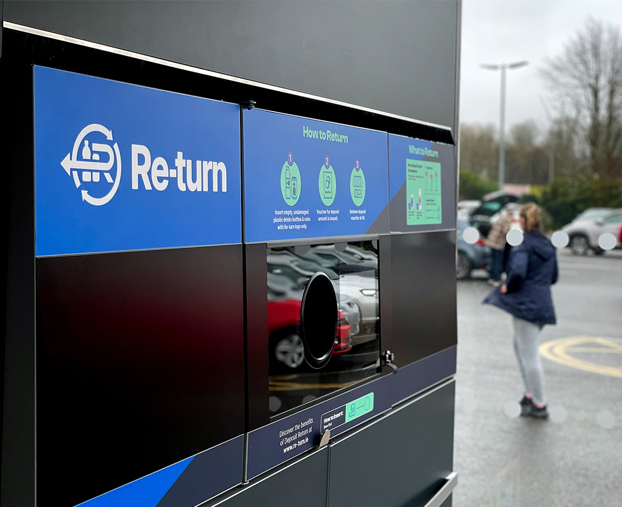
Ultimately Re-turn’s success relies on changing consumer behaviour. It was therefore important that Re-turn feel friendly, engaging and approachable but also represent respected leadership and guidance with in-depth knowledge for producers and retailers. Typography, colour and layout became key aspects in striking this balance. Bespoke iconography also served as a way of simplifying complex information, making consumer facing communications more convenient, clear and straightforward.
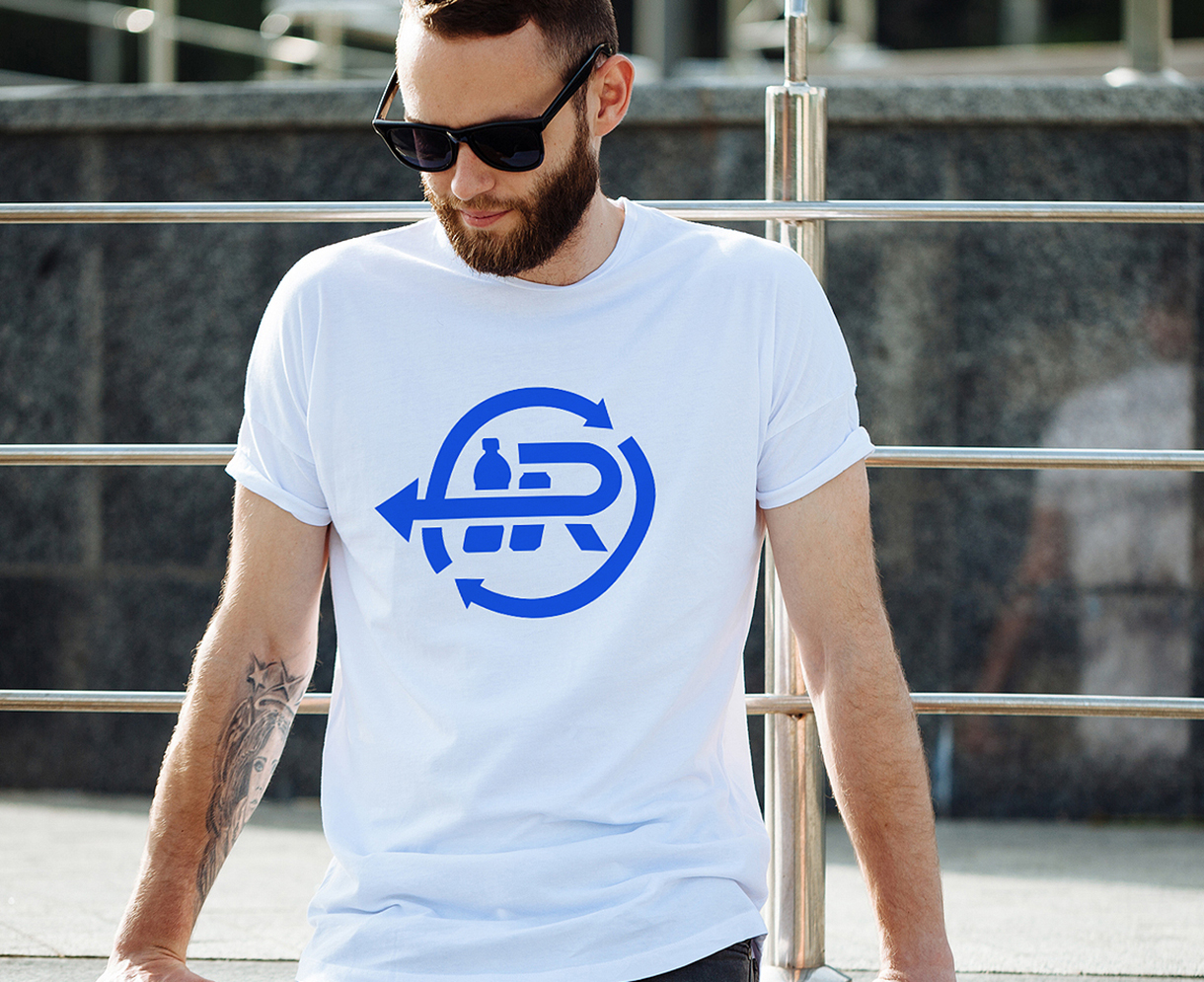
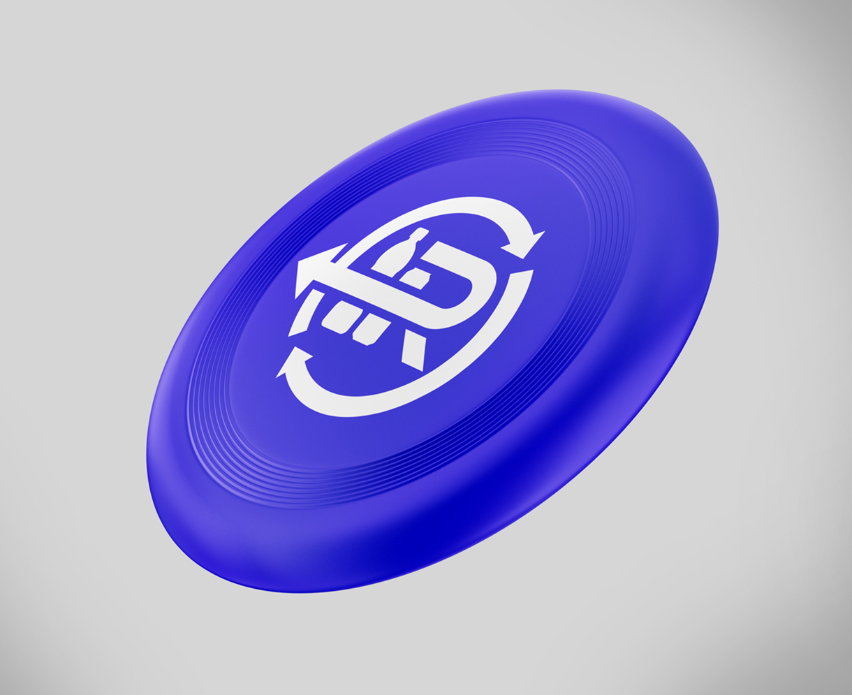
The brand logo itself also needed to encompass a very clear symbol that could be easily recognised and understood by all, and importantly work at a small size on bottles and cans. Derived from the symbol, the triangular ‘active arrow’ graphic device serves a familiar but modernised environmental motif. The device provides flexibility and further cohesion and distinctiveness for the brand.
WHAT WE DELIVERED
Brand Strategy
– Research & Insight
– Workshops
– Brand Alignment
– Brand Positioning
– Tone of Voice
– Messaging
Brand Identity
– Visual Brand Identity
– Verbal Brand Identity
Brand Expression
– Digital & Social Comms.
– Producer & Retail Comms.
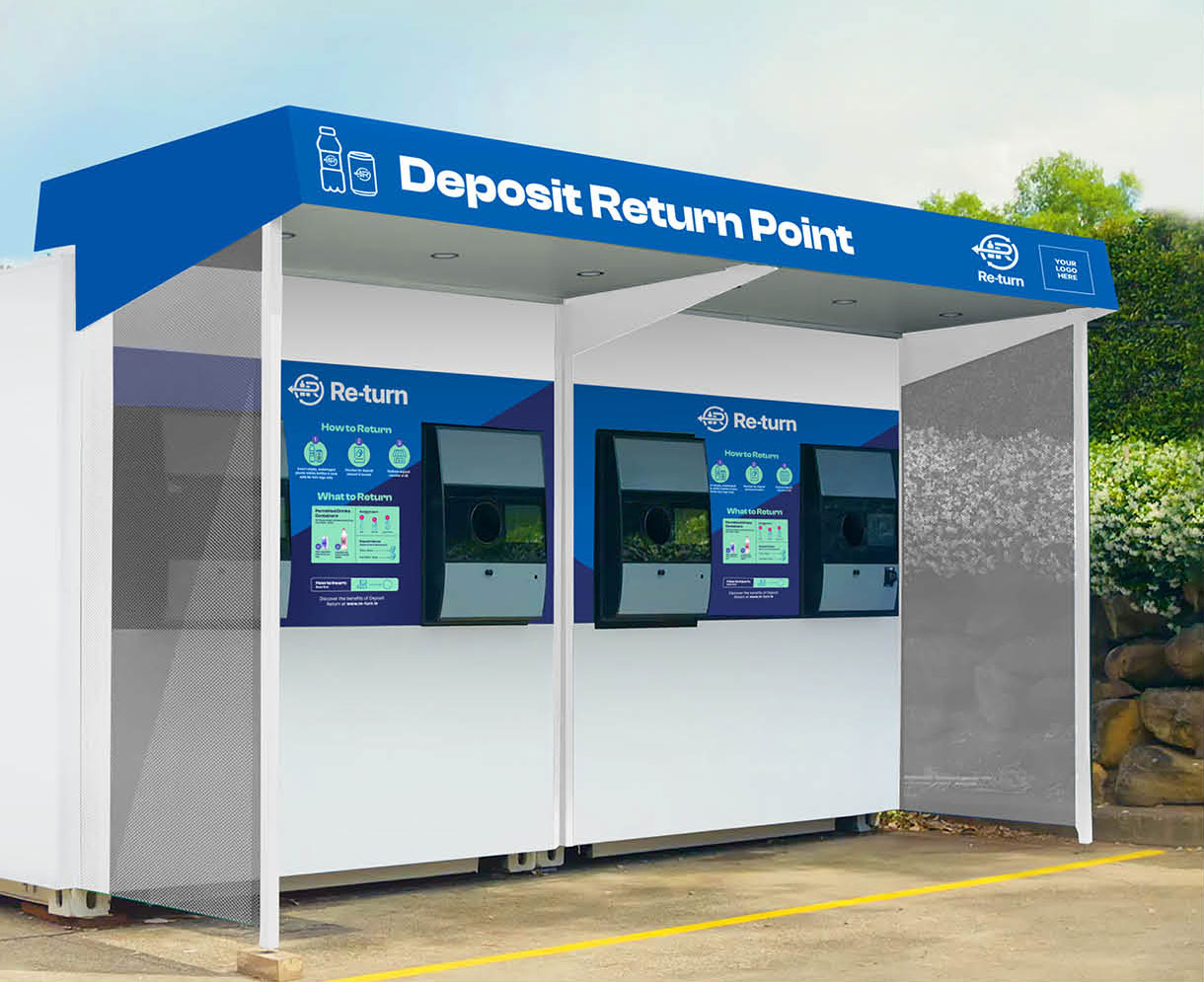
– Livery & Infrastructure

With nearly 2 billion single use drinks containers sold each year in Ireland, and a variety of competing symbols placed upon each one, we knew that the Re-turn mark had to be instantly distinguishable for the consumer.

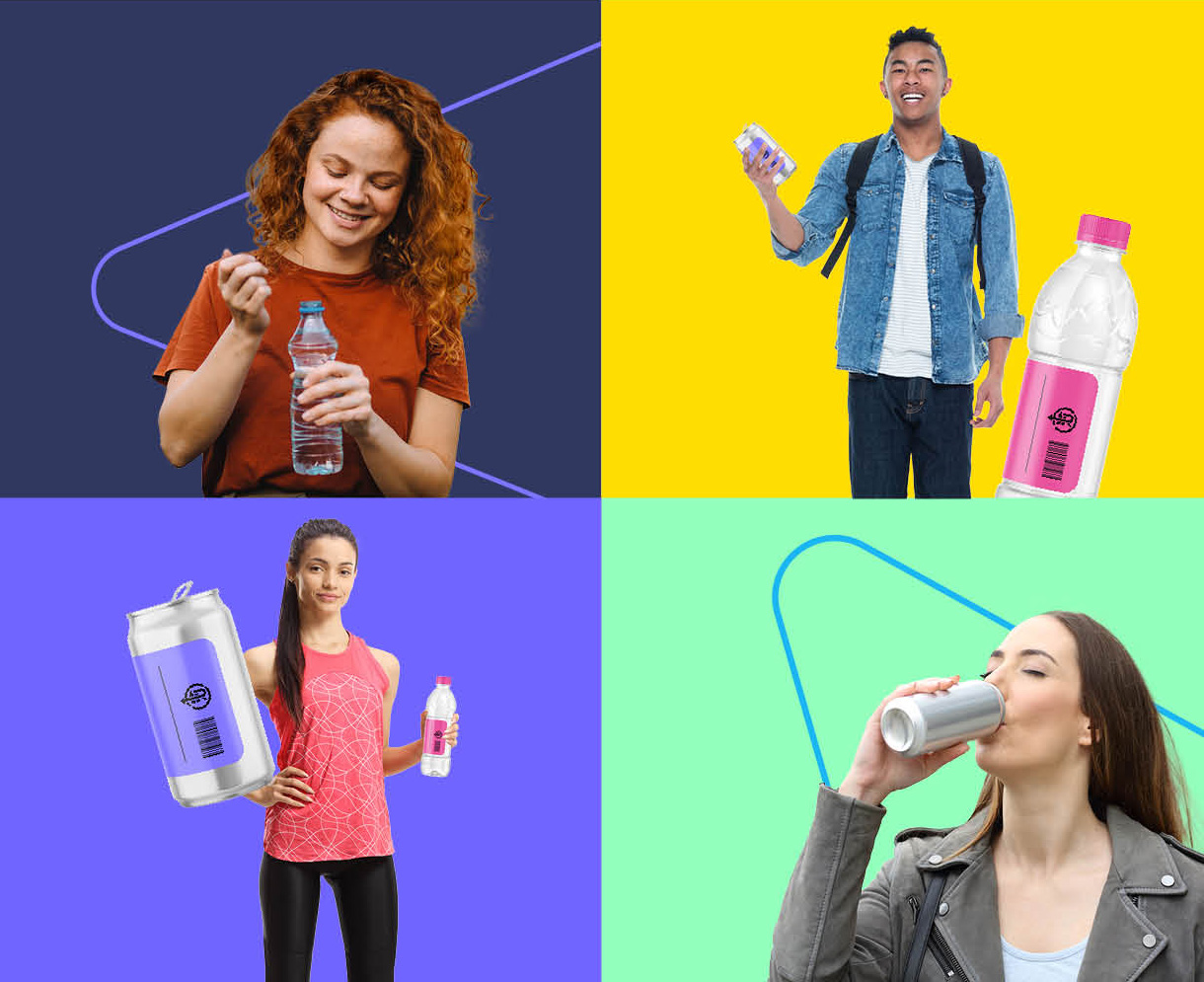
The next generation being key drivers of sustainability efforts, it was vital that the brand speak to parents and children alike, as well as the environmentally conscious young adults who will become future champions of the scheme.