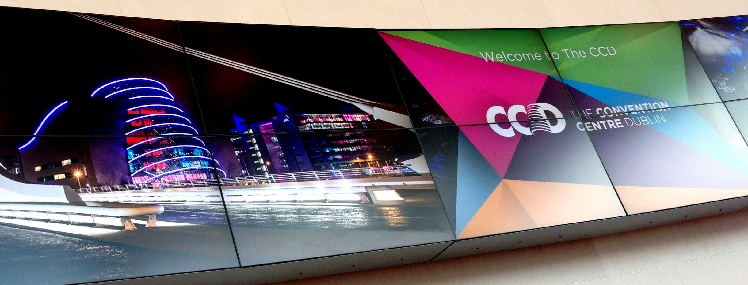
PROJECT BACKGROUND – UNCONVENTIONAL DUBLIN
The CCD is Ireland’s first purpose-built convention centre, located In Spencer Dock in Dublin’s docklands area. Principle were awarded the contract to design the brand identity and system for this national icon.
Developed as part of a Public Private Partnership with the Office of Public Works (OPW), the CCD is the first state-owned, public-access building to be constructed since the foundation of the Irish State.
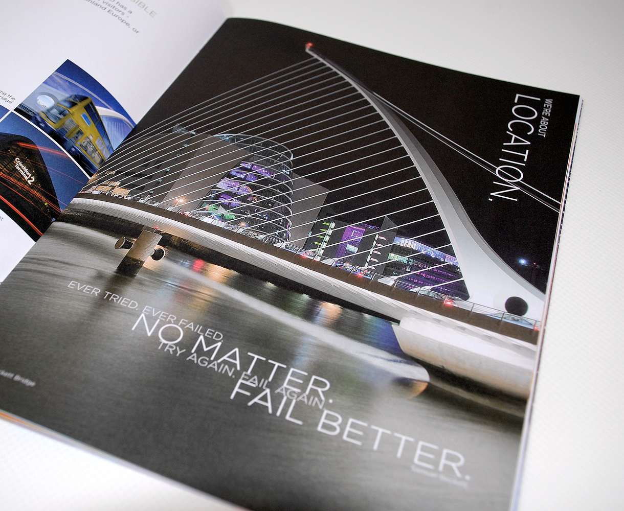
BRIEF MEETINGS
The unique design of the building, by late Irish-born architect Kevin Roche, is unlike anything previously constructed in the city.
The brief suggested that the brand mark might acknowledge its form and complement its architectural attributes. As the CCD is one of the most modern buildings in Europe in terms of materials and state-of-the-art facilities, the brand should denote a contemporary look to communicate Dublin as a modern city and the CCD as its preferred convention venue. Comprising seven sub-brands for individual functions within the organisation of conventions we needed the brand to adapt to meet the needs of an array of individual services.

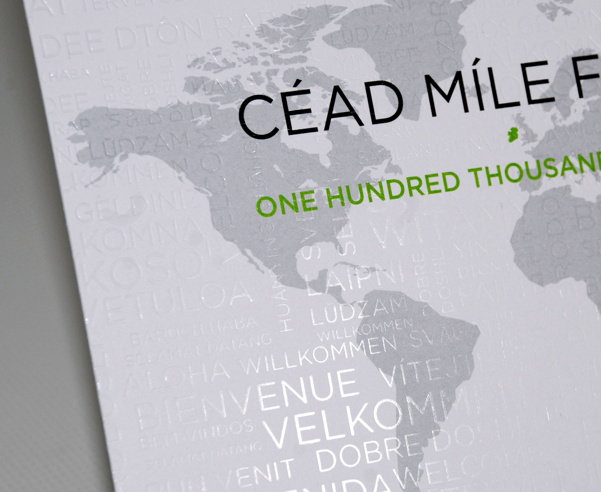
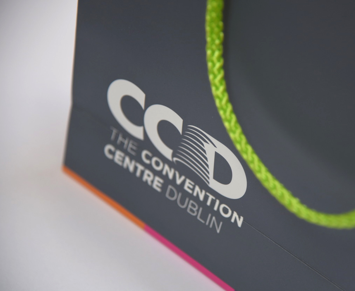

BRAND IDENTITY – DESIGN CONVENTIONS
It’s difficult not to be impressed by the atrium of the CCD from both outside or looking up from the foyer, yet there were many other experiences that we wanted to communicate through the wider identity.
On the human side – there are interactions and successful meetings; on its technical ability – the state of the art facilities; on its environmental issues – a carbon neutral building; on external influences – conventions as a destination choice can be led by the city itself.
In our research we looked at convention venue branding worldwide and discovered that, generally, if the building was architecturally significant, it strongly influenced the brand identity. Nonetheless, we explored a number of different avenues for the initial concepts but after wider consultation and the architects own input, we pursued our creative route. Using a strengthened sans-serif font, we led with the CCD for the main mark. We used the rings of the atrium, insetting them to the ‘D’ with the relationship between both atrium and D mirroring the detail of the building itself.
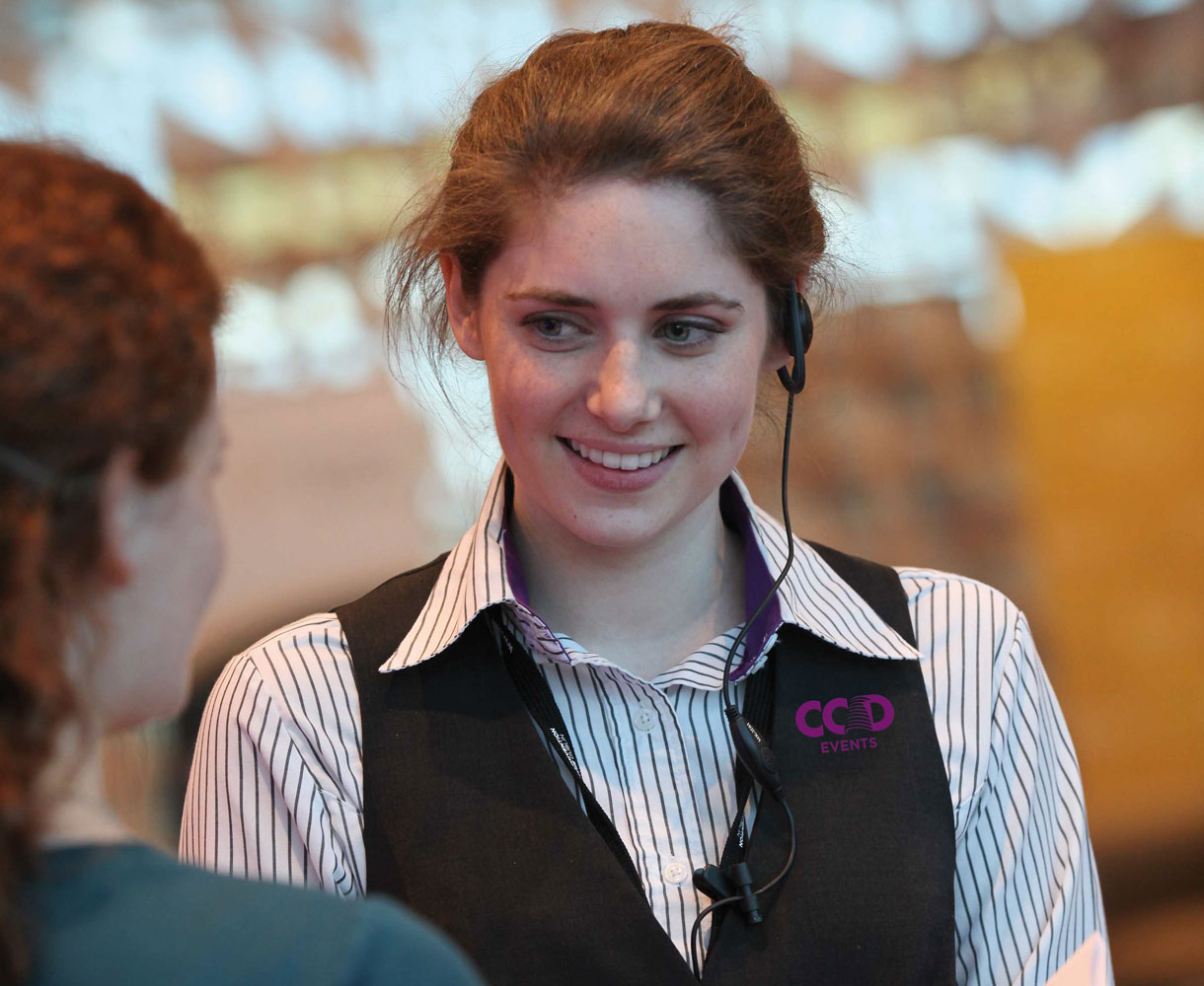
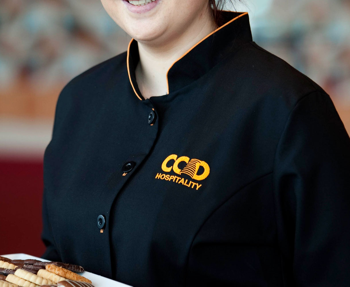
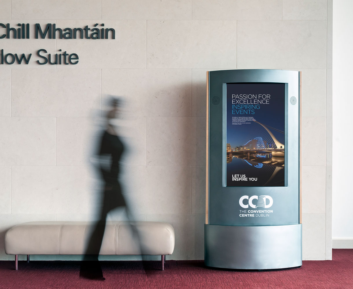
BUILDING OUT THE BRAND
The launch in 2010 was a national event with some 1,200 invited guests across Irish society.
We continue to work with the CCD in implementing their brand, designing promotional, informational and delegate experience material, developing the brand further to assist them create the ultimate modern convention experience. We support their marketing requirement in promoting the venue, designing their main sales promotional tools – national and international brochures and campaigns in print and digital.
